
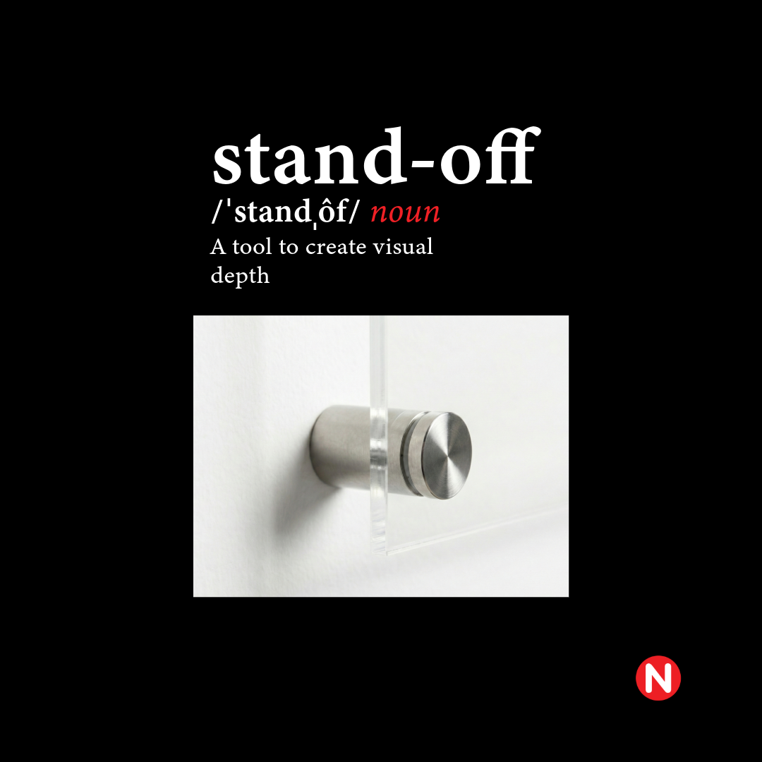
Adding Depth to Your Brand
Turn a flat sign into an architectural feature. Learn how stainless steel "stand-off" hardware uses shadow and depth to add weight, value, and a premium feel to your office reception signage.
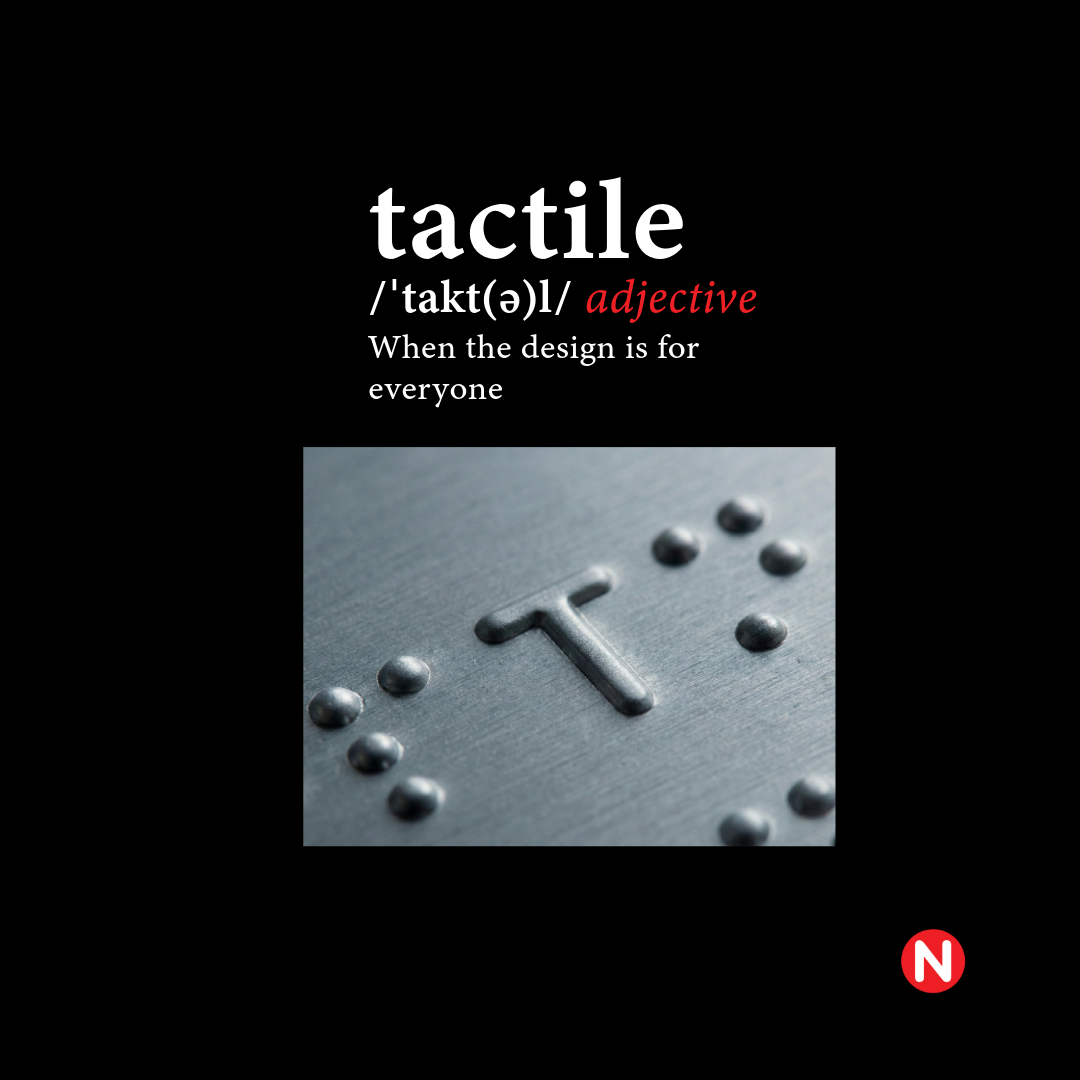
Accessibility Meets Aesthetic
Compliance doesn't have to be ugly. We explore how to design AODA-compliant tactile and Braille signage that meets strict Ontario accessibility codes while seamlessly integrating with your building’s high-end architectural design.
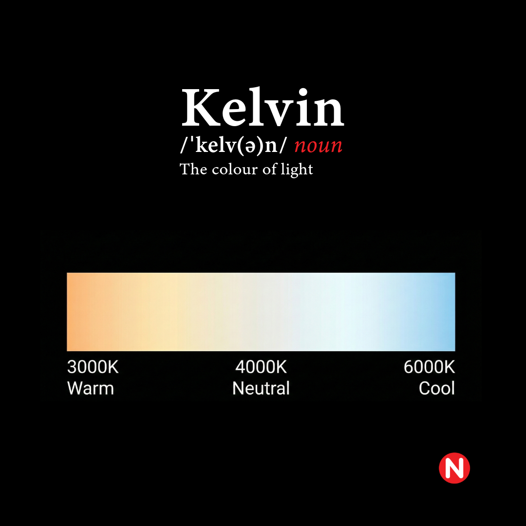
Setting the Mood with Light
Is your lighting making your brand look clinical or cozy? Understanding Kelvin temperature (3000K vs. 6000K) is the key to matching your illuminated signage to your environment. Learn how to choose the right light for your vibe.
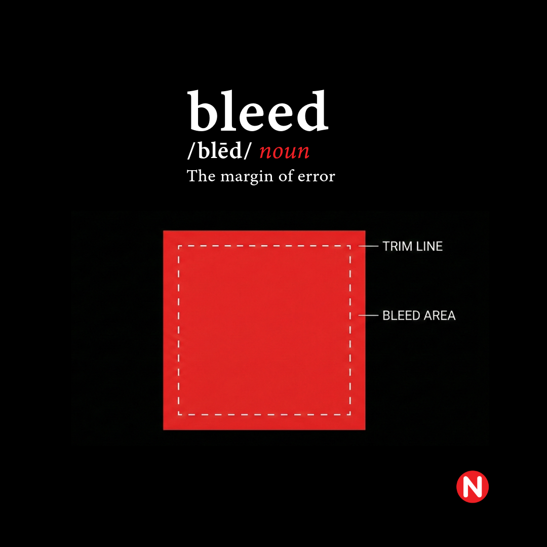
The Secret to Perfect Edges
Avoid the ugly white hairline on your printed materials. "Bleed" is the print industry standard for extending ink past the cut line. Discover why this 0.25-inch margin of error is essential for a flawless, edge-to-edge finish.
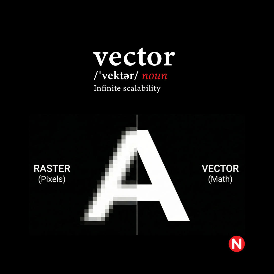
Why "High-Res" JPEGs Aren't Good Enough
Learn the critical difference between Raster (JPEG) and Vector (EPS) files, and why we require math-based artwork to keep your large-format signage razor-sharp at any scale.